- AI Transformation
Our AI Team
Sofia
Ivan
Vlad
Anton
Technolody Stack
- Services
Full Cycle Development
By Industry
- Works
Other projects
AI Learning PersonalizationSmart content recommendationsHotel AI ConciergeAI assistant for hotel guestsClaims Documentation AutomationPlatform for faster claims processingAI for Candidate ScreeningSmart HR efficiency boosterAI Voice AgentAI agent for hands-free learningLLM Legal SummarizationEfficient and fast legal summariesVision-Based Driving AssistanceReal-time threat detection system - Company
Yellow in Numbers
$2.1B+
Value generated through AI innovation47
Custom LLMs and AI agents deployed30M+
Engaging with products we created98%
Projects delivered within agreed budget
November 20, 2020
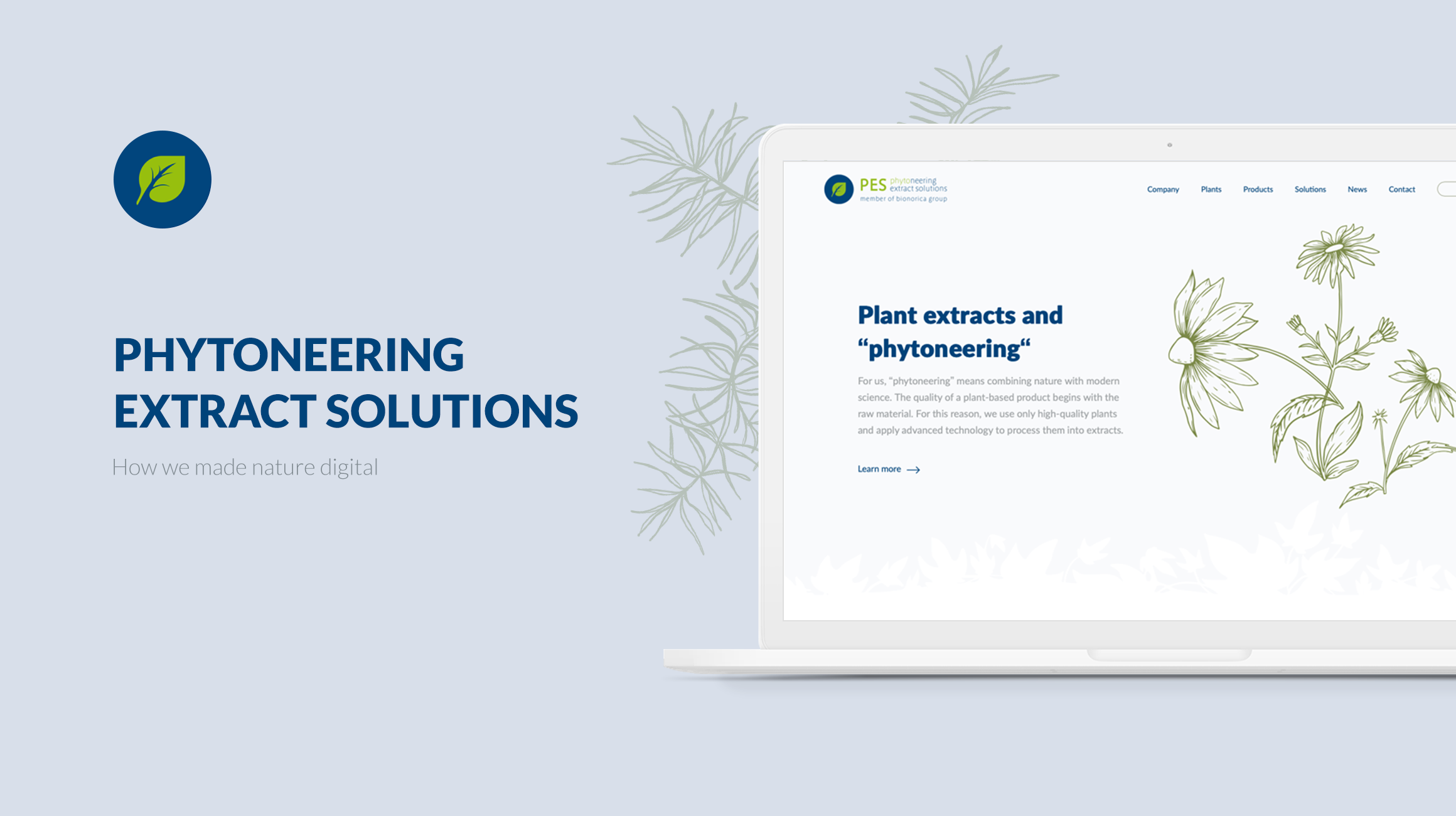
Pharmacy Website Development: How We Made Nature Digital
Imagine that you need to create a modern website for your company in the field of health and natural products. You need a design that fully corresponds to the product’s concept as well as a modern solution and fast site operation. Well, our team can do all this, and we are happy to tell you about our experience!
Undoubtedly, it’s good to have a product that can improve people's lives, make them healthier, and more energetic. But all efforts can hit a wall if you don’t know how to present it correctly and explain its benefits in a way that everyone understands.
While working on the new Phytoneering Extract Solutions website, we made sure that the truth about the benefits of natural products was heard by everyone, and now let’s look at what it took to do this.
A few words about the client
Let's start with a brief description of our client. Bionorica is a pharmaceutical company based in Germany that engages in the production of medicines and dietary supplements based on herbs and useful plants, i.e. their products are of natural, plant origin.
Bionorica also has a wide range of herbal medicines that provide effective help for liver diseases, rheumatism, and sleep disorders.
Today, Bionorica is a group of companies with offices and partnerships on almost all continents. They contacted us to help them work on their project called Phytoneering Extract Solutions (PES). Our particular part was to build a website for this project.
What was our main task and how did we accomplish it?
Our task in working with Phytoneering Extract Solutions consisted of a few steps:
- Conduct a full analysis of their old site.
- Understand what details need to be changed.
- Build its new structure.
- Make a completely new site.
The new site should be a kind of a B2B business card. It should reflect the main activities of the company and explain the advantages of using their products, as well as the advantages of working with them in an easily understood manner.
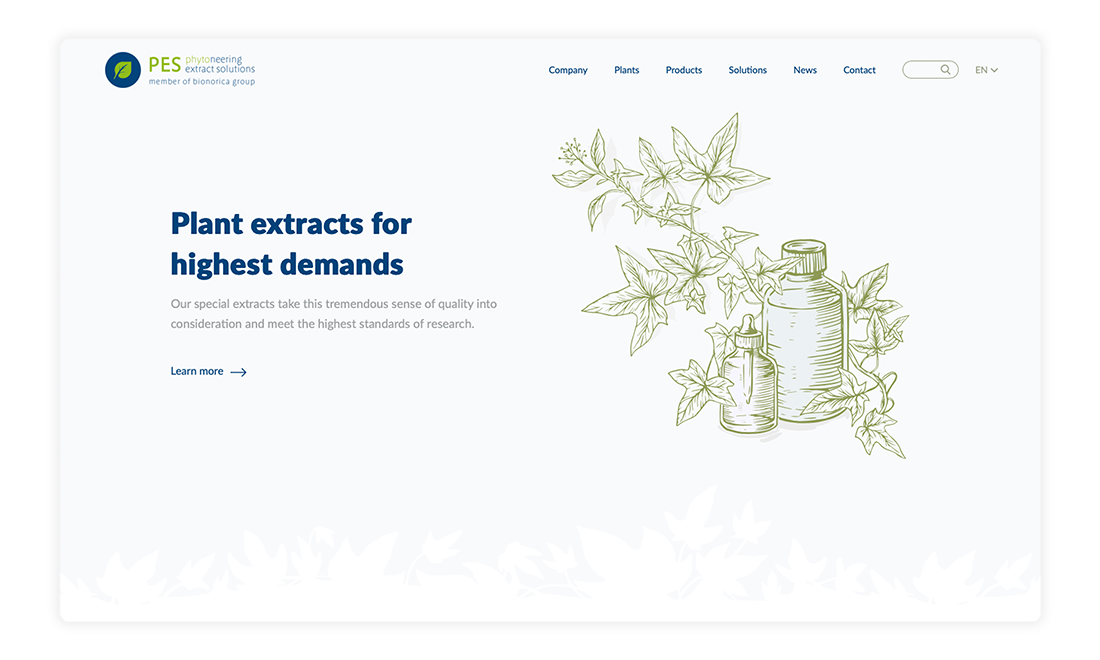
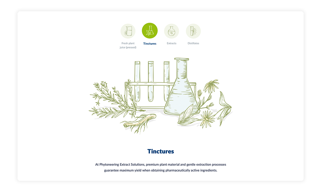
Our result is a user-friendly and dynamic website. A lot of work was done on the design end because we had to predict the behavior of the user and make the site as convenient as possible based on this logic. Also, we created a large number of illustrations from scratch that fully relate to the main concept of the company. Once you get to the site, it immediately becomes clear what Phytoneering Extract Solutions does.

We made sure that the site was not only beautiful but also very fast. According to GTmetrix, we were able to achieve this goal, since almost all indicators reached 100 out of 100 possible points.
Team
The PES website was developed by a team of five people:
- Project manager
- Two full-stack developers
- Tech lead
- Designer
Time
The main stage of development was about 3-3.5 months, and our team together with the client continues updating it.
Tools
When working on the Bionorica project, we used a set of JavaScript frameworks that we use when working with Contentful: React.js, Node.js, and Next.js. They interact quite well with each other and help you to make server-side rendering, which allows you to load pages very easily and makes working with SEO convenient. We took this approach because this project does not have any back-end or database due to Contentful taking on that role.
The value of server-side rendering is pretty high. Without it, the site would be loaded only as the scripts are processed. This is if the site was written exclusively in React.js. So server-side rendering builds the script in such a way that it immediately understands where the site title is, where the tabs are, and so on.
Challenges & solutions
Since our team was faced with the task of developing a completely new site, we faced certain challenges during its creation.
The first and almost the biggest challenge for us was to study the old site in order to develop a completely new one. Since the old site was very difficult to understand and almost impossible to navigate and find the necessary information, it took our team a pretty long time to understand what exactly is required for the site and how to correctly build its structure.

The second challenge for us was to speed up the site optimization. Services such as GTmetrix and PageSpeed Insights helped us check the site's performance. After spending some time testing and optimizing the code, to reduce the executable code and optimize images on the site, for example, we were able to achieve almost the maximum site loading speed.
It was also imperative to provide support for the site's bilingualism (in German and English), which was not so much a challenge but rather an interesting task. At this stage, difficulties appeared such as reloading the site page when changing the language. It turned out that when updating, it took us back to the very top of the page, although we switched the language while in the middle of it. Our goal was to make sure that when switching the language, the user's position on the page remains the same.
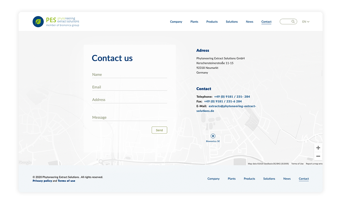
It’s also worth mentioning the work with the Contact page, which contains a form to fill out, brief contact information, and a map. This map is interactive, meaning you can scale it and move it around directly on the page. Our goal was to make sure that it was a real map and not just a picture. To accomplish this, we needed to completely customize it and remove everything that Google shows by default, i.e. all the names of establishments, streets, and so on. Also, we needed to make a custom pin to be integrated as a Google Maps style.

We worked out the map colors, making them gray, white, and black, unlike the classic Google colors. To make this possible, we took the part of Google’s code, where it's written that, for example, the highway should be displayed in black, and replaced it with our own. And for the map to look the way we needed it to, our team had to specify all the color variations.
One of the most interesting challenges for us was the Search field. Since we have a bilingual site, it was necessary to provide the ability to search in two languages for absolutely all content on the site. Site search is usually quite easy to do when we work with one language (Contentful has a tool that allows you to do this without much difficulty). As a solution, we added two separate fields for each page on Contentful called "English search tags” and "German search tags". In this case, our client decided which keywords will be used for the search.
What are the current operations and plans?
The site shows excellent results in terms of loading speed and achieves maximum points on the speed scale and has already been launched and used by our client, who is very happy with the finished product.
If we talk about plans, we are currently preparing an assessment of the integration of the online store. Our team received a request to integrate Shopify in the website we developed so that there would be a separate page where Bionorica could sell its products. With this request, we can say that in the near future we plan to make this site not only a business card but an online shop as well.
To sum it up
No matter how useful your product is, you should always make sure that as much of your target audience as possible knows about it. Fortunately, all the tools you need to accomplish this are available today, one of which is a high-quality website. We are very happy that we were able to create a website that not only allows people to quickly and easily understand the company's product but also that could inspire the client to develop an online store.
Don't waste your time in vain, spend it on developing a quality website!
Contact usGot a project in mind?
Fill in this form or send us an e-mail
Subscribe to new posts.
Get weekly updates on the newest design stories, case studies and tips right in your mailbox.
